Branding
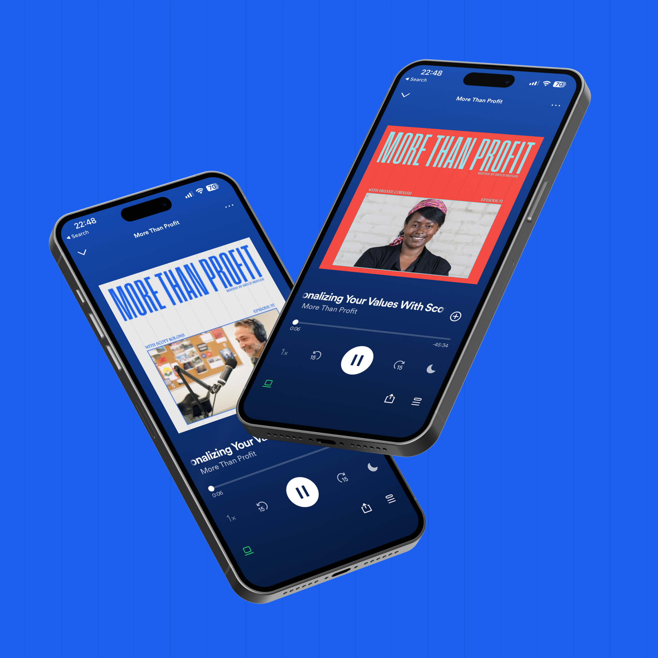
More Than Profit
More Than Profit is a podcast from Access Ventures that asks investors, entrepreneurs, leaders, and more about life, work, and living with purpose. Recently, the host of this podcast decided he wanted to undergo a brand refresh—going from a more conservative style into a more bright and energetic direction.
Learn more about More Than Profit →
The Approach
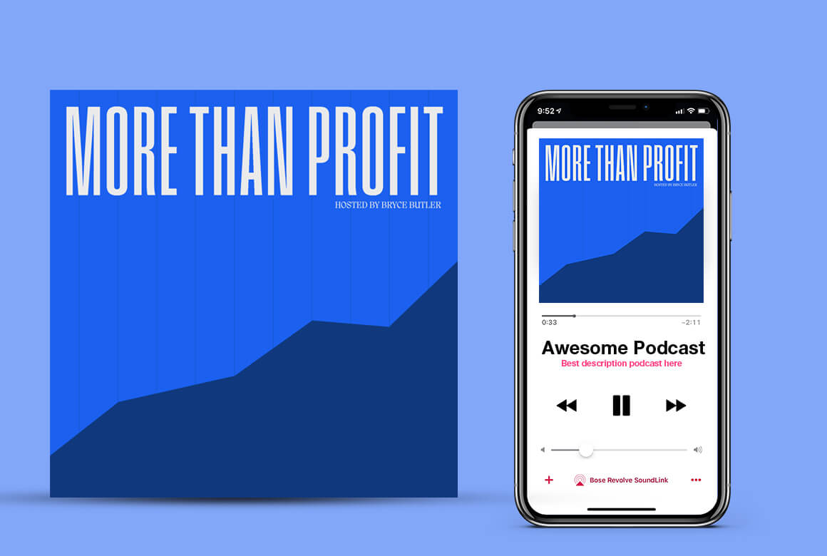
The More Than Profit brand identity previously was primarily type-based, using a heavier, extended sans serif and utilizing colors from the Access Ventures brand color palette. In this brand refresh, and in the pursuit of creating more energy around the podcast, I opted for a brighter color palette and a bolder logotype that can easily scale up, down, and/or scaled in different ways (within a grid system) to create more variability for the brand/logotype.
The grid system for the new design on the left still maintains the original's squared-off design style that maintained the primary subject and old logo. For the brighter color palette, I brightened up the darker blues and kept some of the green, but added some additional tones to the group such as bright orange-red and lighter blue. This creates a fun palette that can be intertwined together for lower or higher-contrast designs.
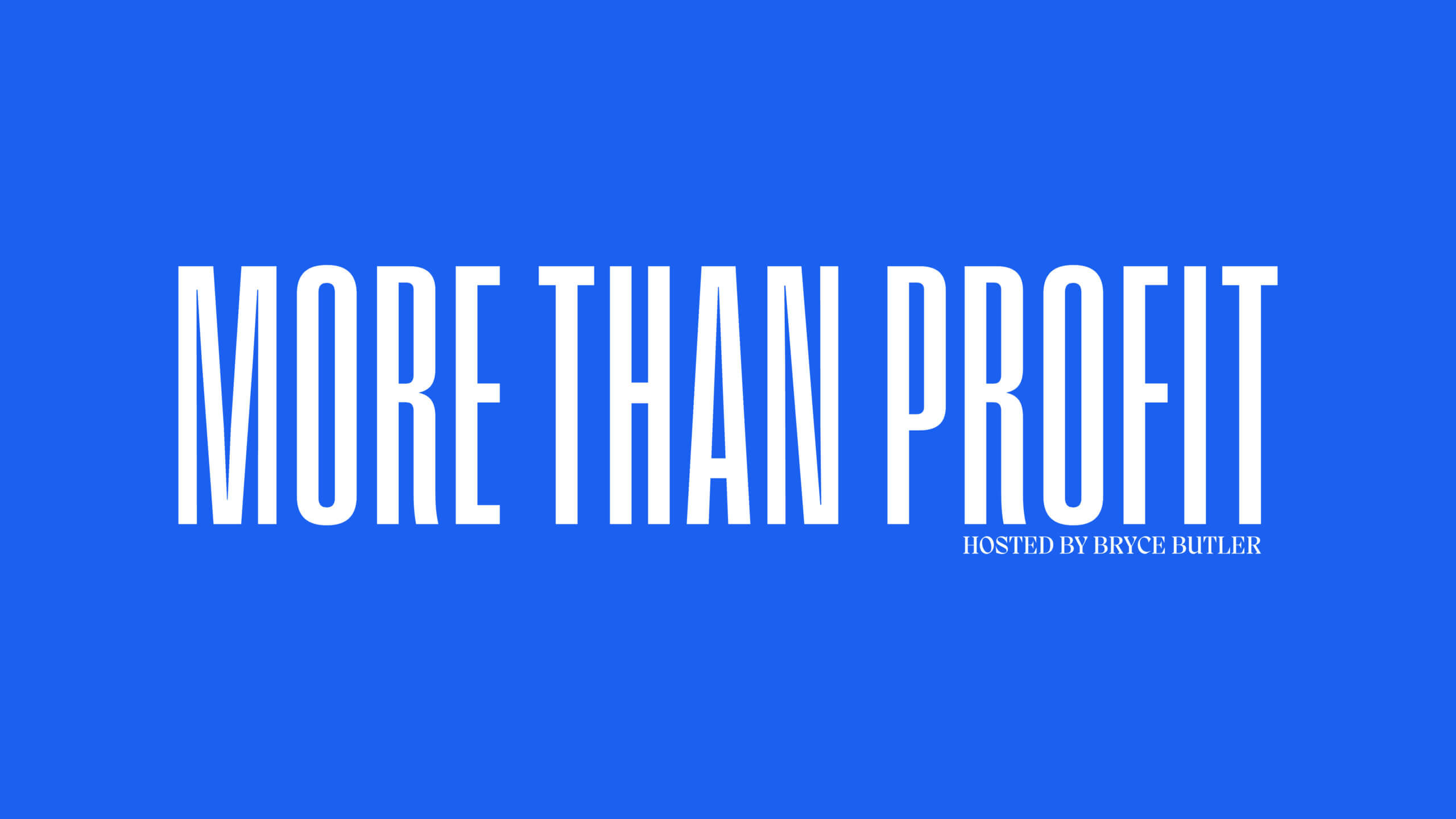
For the new logotype, it needed to make more of a statement, it needed to be able to scale around better than the previous type, and it need to move towards a more modern design style. This brand refresh was to be a mix between the previously more conservative/modern and newer bright/modern tones. So, I opted for a bolder, condensed type style that felt like the perfect in-between. This type evokes a strong response and with the brighter color palette to bring down the perhaps more 'abrasive' feel. This new style gives More Than Profit a fresher, energetic feel, and look for a podcast that lives in the traditional business space on the podcast charts.
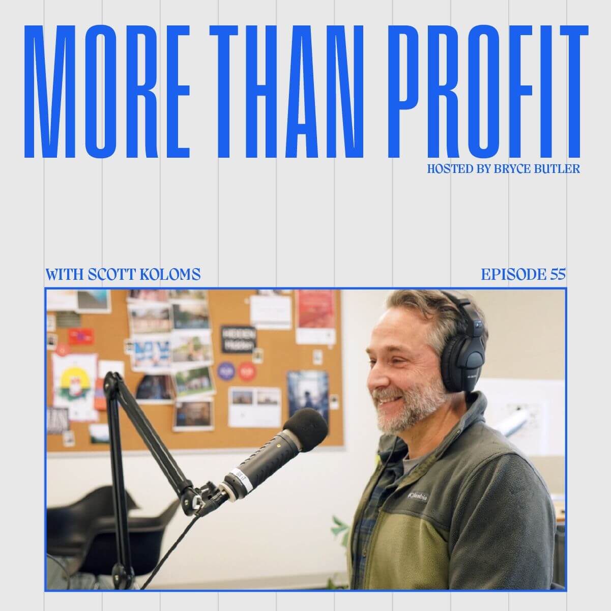
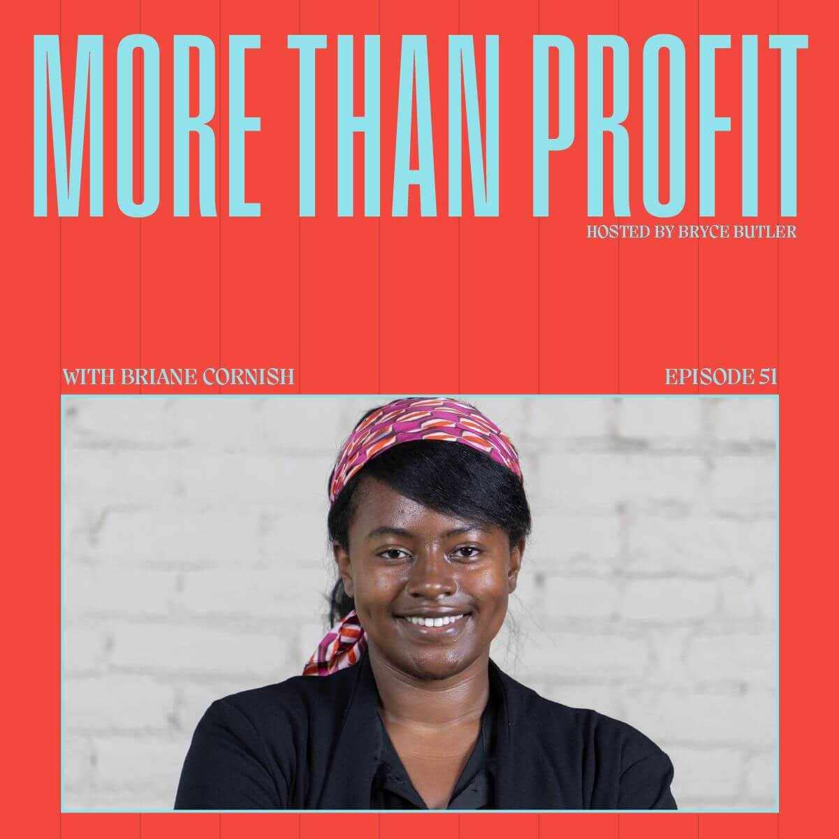
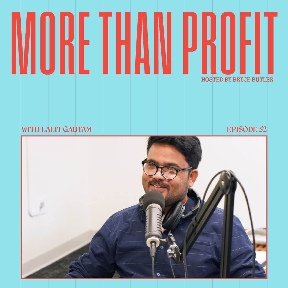
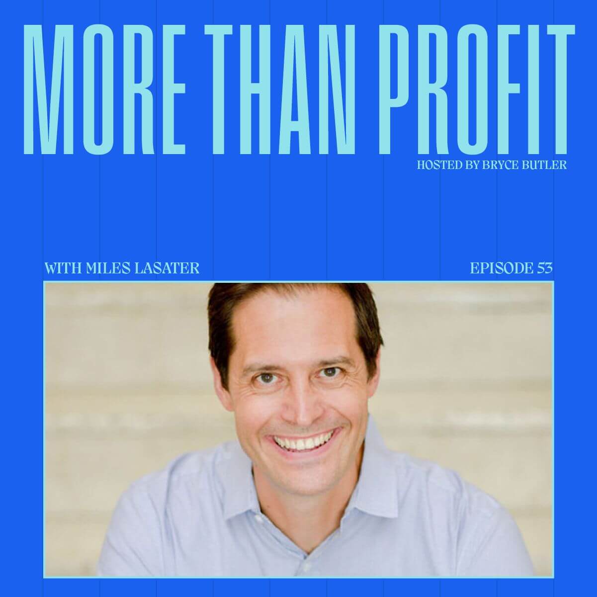
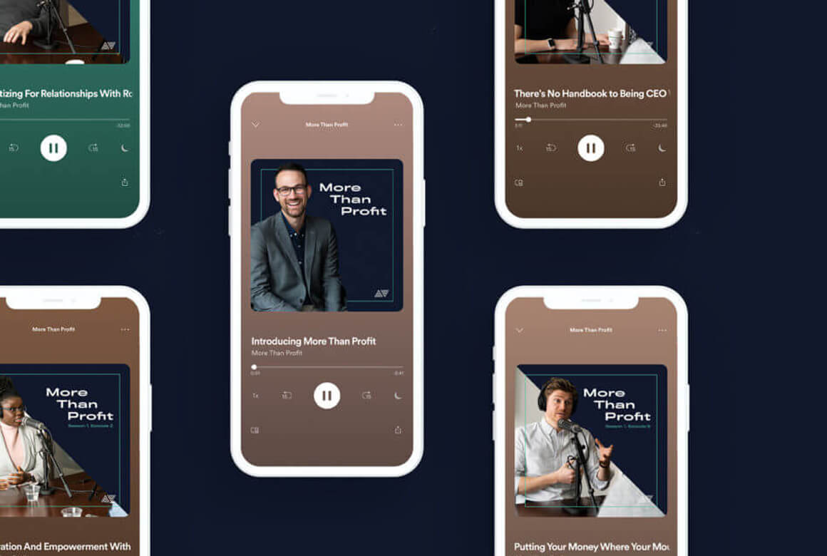
I decided to lean into the new color palette and create a cycle of different podcast covers for More Than Profit's guests. This way, each guest episode feels fresh versus using the same cover for every single episode. It also gives a more fun and experimental look, playing into the podcast's overall take on wanting to do business differently/living beyond just business. The serif typeface was brought in to give a bit more texture for the brand and lean into the modern, eclectic feel of the brand refresh.
Selected Works
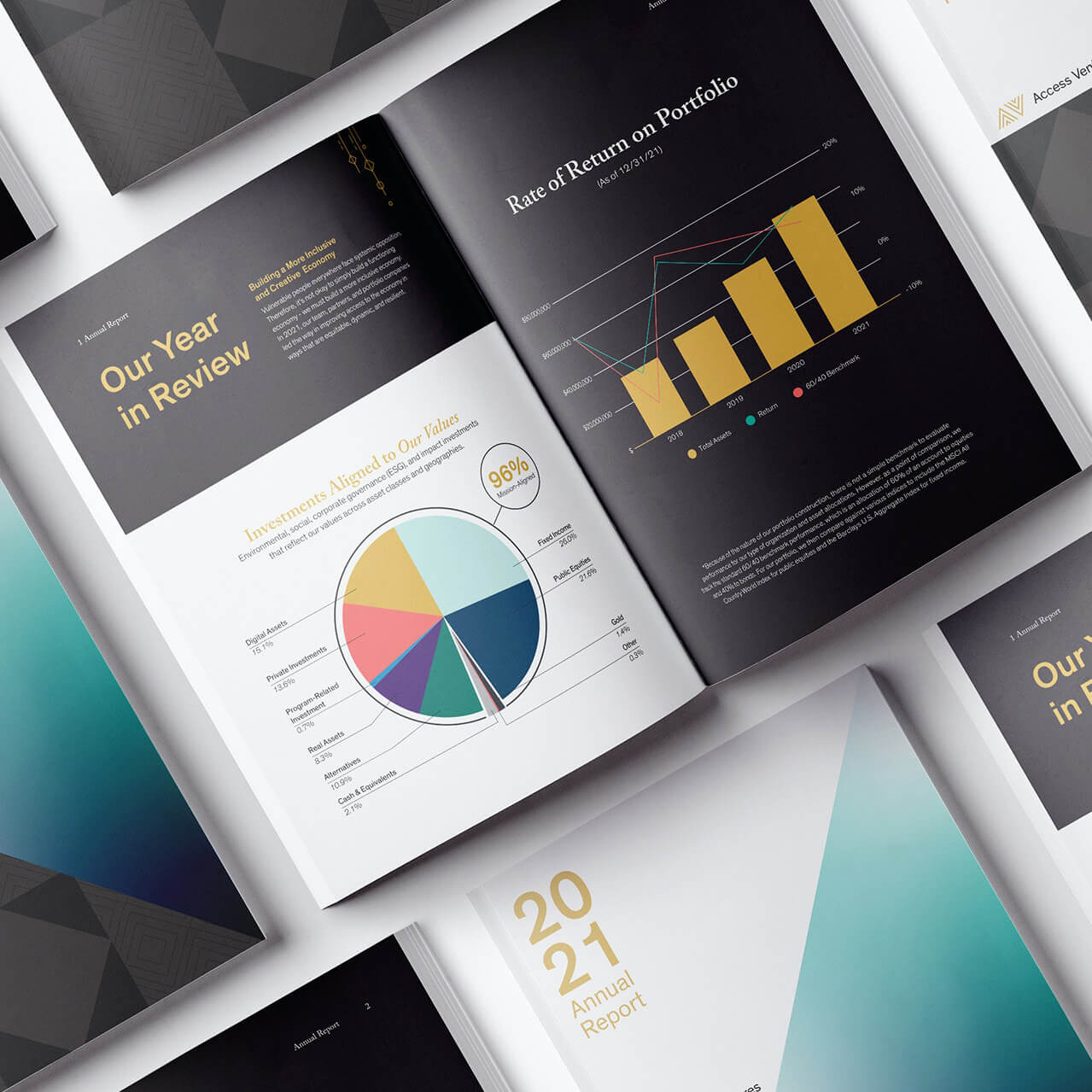
Access Ventures' Annual ReportAnnual Reports, Art Direction
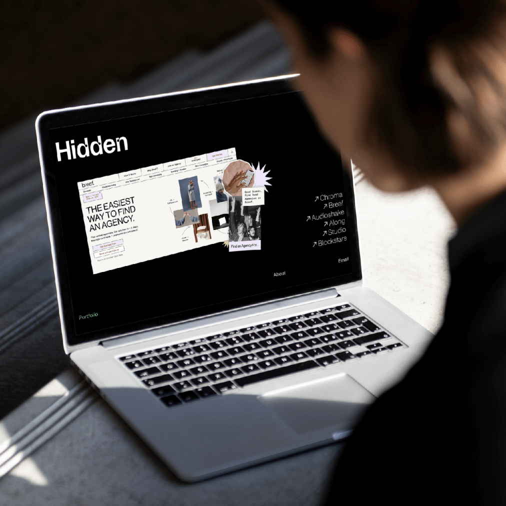
Hidden VenturesBranding
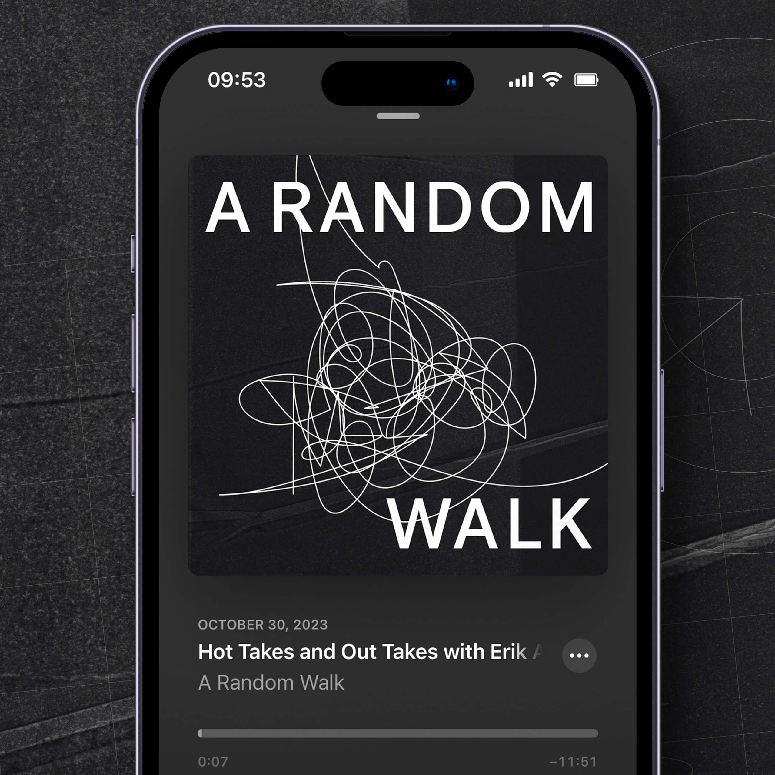
A Random Walk PodcastBranding, Art Direction
More Than ProfitBranding
Editorial PhotographyEditorial Photography
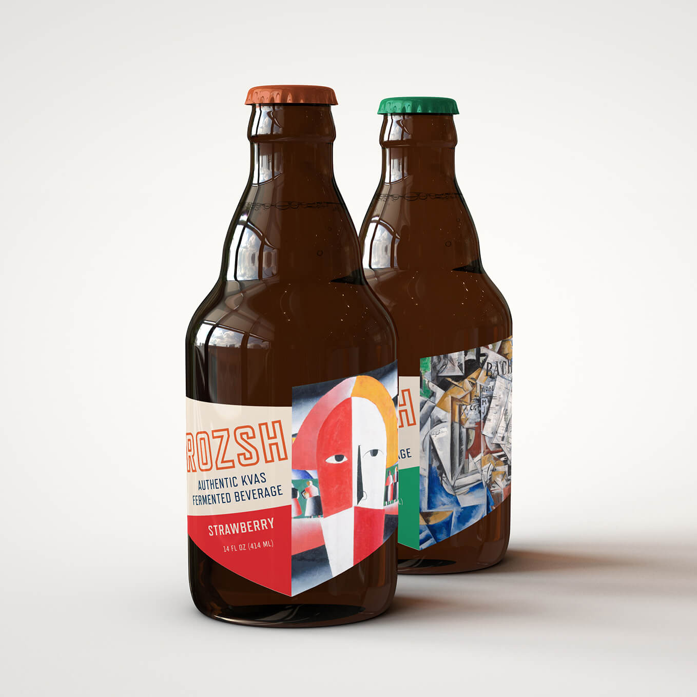
RozshPackaging
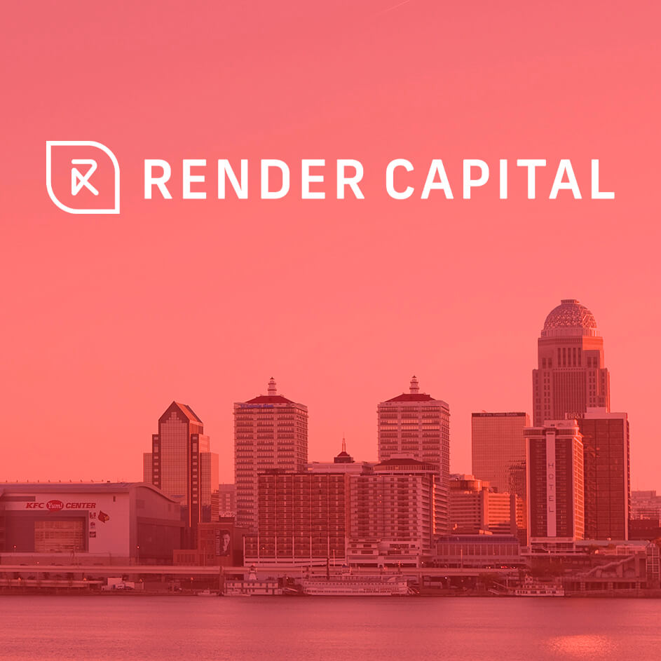
Render CapitalBranding
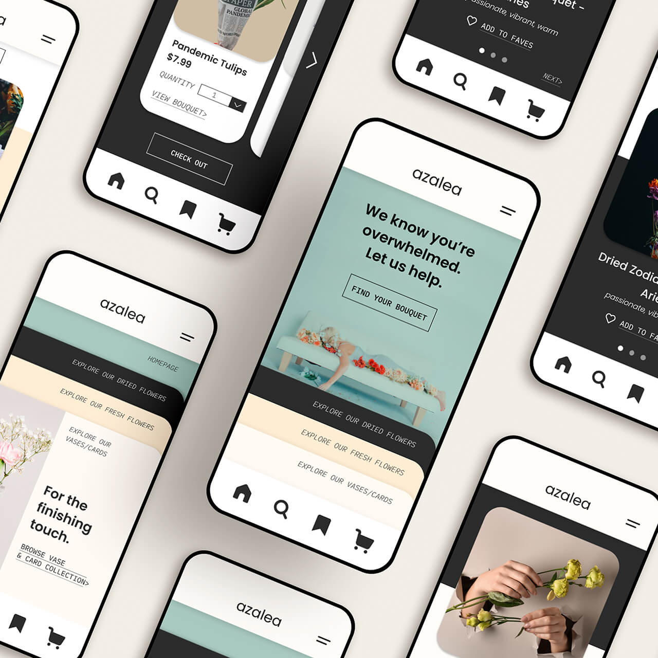
AzaleaUX/UI
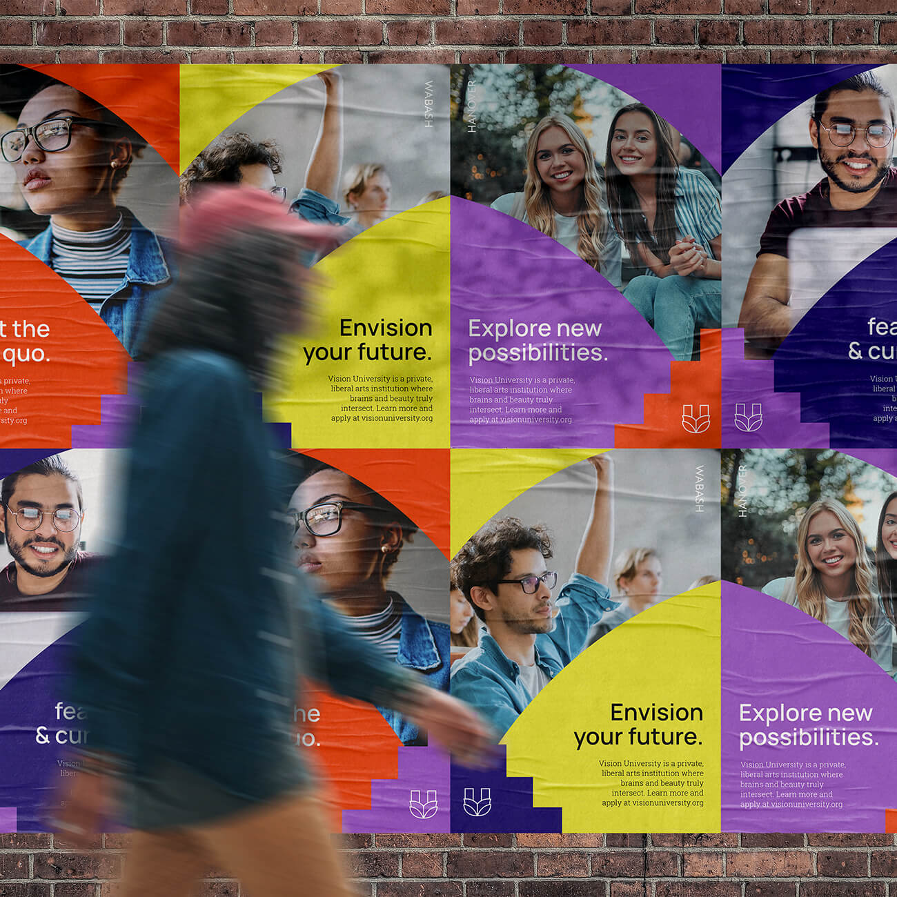
Vision UniversityBranding Design
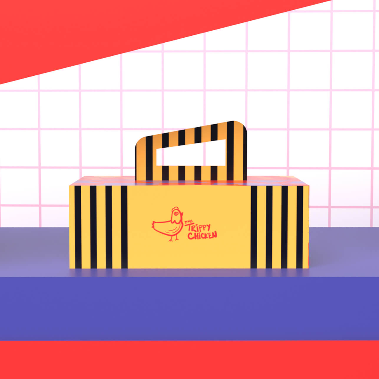
The Trippy ChickenProject type